
What Is the Mobile Readiness Scan?
A web application and a mobile application don’t always behave in exactly the same way. Your project might work perfectly in a desktop browser while still containing elements that need attention before mobile export. The Mobile Readiness Scan helps identify those issues. The workflow is:When Should You Run a Scan?
Run the Mobile Readiness Scan after the main application is working and you’re preparing to move toward Android or iOS. Ideally:Run Your First Scan
Open the project you want to prepare for mobile. Navigate to the Mobile Export area and start the Mobile Readiness Scan.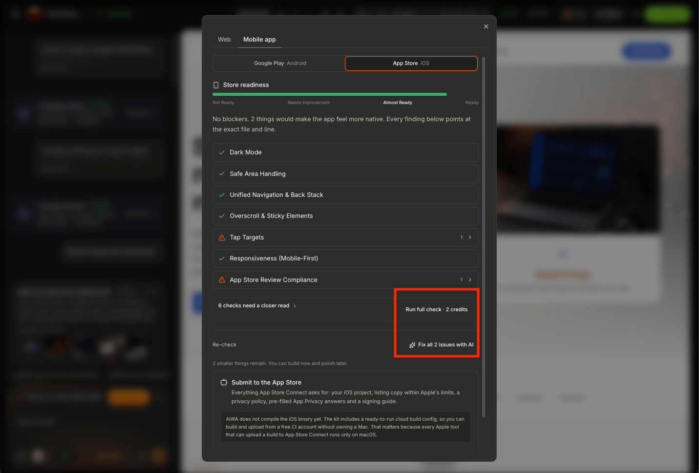
Understanding Your Scan Results
The readiness results help you understand the state of your application before creating a mobile build.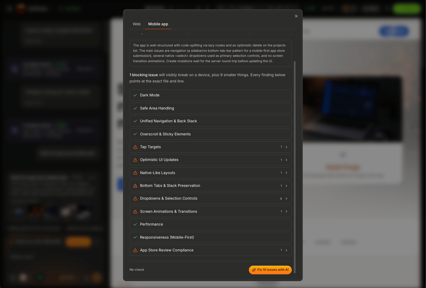
My application is broken.Instead, think of it as:
There’s something I should address before packaging this application for mobile.
What AIWA Is Looking For
Mobile readiness involves more than visual responsiveness. AIWA needs to consider whether important parts of your application can provide a usable experience in a mobile environment. Depending on your application, areas worth reviewing include:- Responsive layouts
- Navigation
- Touch interactions
- Forms
- Authentication
- Dialogs and modals
- Tables
- Images
- File uploads
- External links
- Integrations
- Application workflows
- Mobile-specific behavior
Responsive Layouts
One of the first things to check is whether the interface adapts properly to smaller screens. For example, a desktop layout might be:Navigation
Desktop navigation patterns don’t always translate well to mobile. For example, a permanent sidebar may need to become:- A collapsible menu
- A drawer
- A compact navigation experience
- Another touch-friendly navigation pattern
Could someone comfortably use this application with one hand on a phone?
Touch Targets
Buttons and controls need to be easy to tap. A tiny icon that works perfectly with a mouse may be frustrating on a touchscreen. Review:- Buttons
- Menu items
- Icons
- Dropdowns
- Tabs
- Checkboxes
- Table actions
- Form controls
Forms
Forms are one of the most important areas to test. Suppose your desktop form looks like:- Input visibility
- Validation messages
- Dropdowns
- Date pickers
- Submit buttons
- Long forms
- File uploads
- Keyboard interaction
Tables
Tables are common in SaaS applications, CRMs, admin dashboards, and internal tools. They’re also one of the easiest desktop patterns to get wrong on mobile. Imagine:Modals and Dialogs
Check whether dialogs fit inside smaller screens. A modal designed for desktop can sometimes:- Extend beyond the screen
- Hide buttons
- Become difficult to scroll
- Place important controls behind the keyboard
Authentication
Test the complete authentication experience on mobile. This includes:Images and Media
Large images can affect the mobile experience. Check:- Image sizing
- Aspect ratios
- Galleries
- Avatars
- Hero images
- Uploaded media
- Video
- Loading behavior
External Links
Your application may open:- Payment pages
- Scheduling pages
- Documents
- External websites
- Authentication providers
- Third-party services
Integrations
If your application depends on connectors, include them in your mobile testing. For example:Fixing Readiness Issues
If the scan identifies something that needs attention, work through the issues before exporting. For example, you might tell AIWA:Optimize the customer dashboard for mobile based on the readiness issues identified. Preserve the current desktop experience and functionality.Or:
Fix the mobile navigation and table issues identified by the readiness scan without changing the existing desktop layout.AIWA can then work on the specific areas that need improvement.
Don’t Fix Everything by Redesigning Everything
A readiness issue doesn’t necessarily require a complete redesign. For example, if the problem is:Customer table doesn’t fit on mobile.Don’t immediately ask:
Completely redesign my entire CRM.Instead:
Make the customer table usable on mobile while preserving the existing desktop table and functionality.Smaller, targeted changes reduce the risk of breaking working parts of your application.
Preserve the Desktop Experience
Mobile optimization shouldn’t unnecessarily damage the desktop version. Tell AIWA when both experiences matter. For example:Optimize this dashboard for mobile screens while preserving the current desktop layout for larger screens.Conceptually:
Re-Run the Scan
After addressing the identified issues, run the Mobile Readiness Scan again.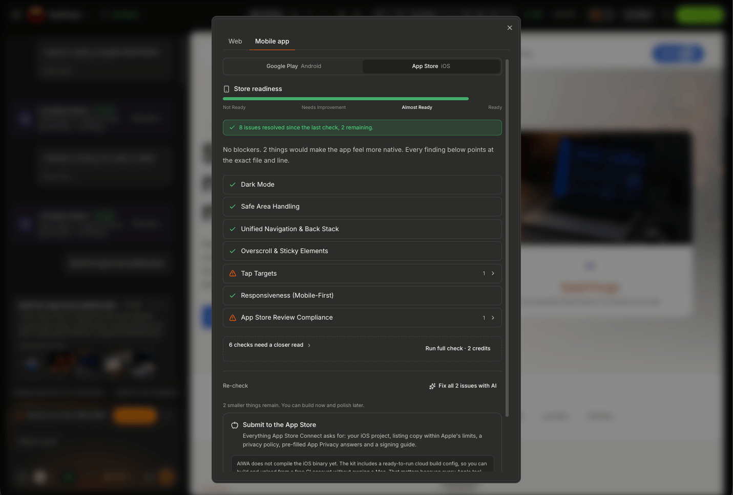
Test Manually Too
The Mobile Readiness Scan is a useful tool, but it shouldn’t replace actually using your application. Open the mobile preview and walk through the important customer journeys. For example, for an e-commerce application:Test Different Screen Sizes
Mobile devices aren’t all the same size. An application that looks good on a large phone may have problems on a smaller one. Pay particular attention to:- Fixed widths
- Long text
- Navigation
- Tables
- Forms
- Buttons
- Bottom actions
- Modals
Portrait Orientation
Most users will interact with your application in portrait orientation. Make sure the primary workflows work comfortably in that layout. For example:Check for Horizontal Scrolling
Unexpected horizontal scrolling is often a sign that something doesn’t fit properly. Common causes include:- Wide tables
- Fixed-width components
- Large images
- Long unbroken text
- Desktop navigation
- Oversized modals
Check Fixed Elements
Applications sometimes use fixed:- Headers
- Navigation
- Chat widgets
- Action buttons
- Bottom bars
Test Empty States
Don’t only test screens full of sample data. Test what a new user sees. For example:Test Error States
Also test what happens when something goes wrong. For example:Mobile Performance
Mobile users may have slower connections and less powerful devices than desktop users. Avoid unnecessarily heavy experiences where possible. Be mindful of:- Very large images
- Excessive media
- Large amounts of content loaded at once
- Heavy animations
- Unnecessary visual effects
Payments Require Special Attention
If your application involves payments, don’t treat mobile readiness as only a layout problem. Applications distributed through Google Play or Apple’s App Store may be subject to store-specific payment requirements depending on what you’re selling. Before submission, make sure the payment model complies with the requirements of the store you’re targeting. We’ll discuss store submission separately.A Good Mobile Optimization Prompt
A strong prompt could look like:Review the application for mobile readiness. Preserve the current desktop experience. Optimize the navigation, dashboard cards, customer tables, forms, dialogs, and primary workflows for smaller touch screens. Avoid unnecessary horizontal scrolling and ensure important actions remain easy to access. Don’t remove any existing functionality.That’s much stronger than:
Make it mobile friendly.
Use Plan Mode for Complex Applications
For a large application, consider planning the mobile adaptation before changing anything. For example:Analyze this application for mobile use. Identify which layouts, navigation patterns, tables, forms, dialogs, and workflows need to change for a good mobile experience. Create a plan only. Don’t modify the application yet.Review the plan. Then implement the changes.
When Is Your Application Ready?
Mobile readiness doesn’t mean:Every screen looks exactly like the desktop version.It means the important application experiences work effectively on mobile. Before export, you should be confident that users can:
- Navigate the application
- Read important content
- Use primary features
- Complete forms
- Authenticate
- Access their data
- Complete critical workflows
- Recover from errors
Mobile Readiness Checklist
Before moving to export, check:- Mobile Readiness Scan completed
- Major readiness issues resolved
- Navigation works
- No unexpected horizontal scrolling
- Buttons are touch-friendly
- Forms work
- Tables are usable
- Modals fit
- Authentication works
- Images display correctly
- External links work
- Integrations work
- Important workflows work
- Empty states work
- Error states work
- Desktop experience still works
- Application tested manually on mobile
From Scan to Export
The process should look like:Next: Export for Android (APK) [Agency]
Your application is mobile-ready. Next, we’ll take it to Android. We’ll cover:- Starting an Android export
- Preparing your application
- App name and identity
- App icon
- Package information
- Generating the Android build
- Downloading and testing the build
- What to do when an export fails
- Preparing for Google Play submission
Export for Android (APK)
Generate an Android build of your AIWA project.